|
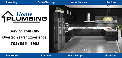
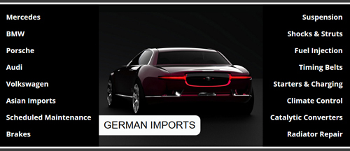
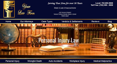
If you need mobile web design in Las Vegas or anywhere in the nation – we should be your first call. We’ve stayed in business for 20 years by adapting as the internet evolves. Our innovative Mobile / Desktop designs are the only truly mobile and desktop friendly web designs in the industry. View our samples (below) on mobile and desktop. If you like what you see - we can do the same for you.
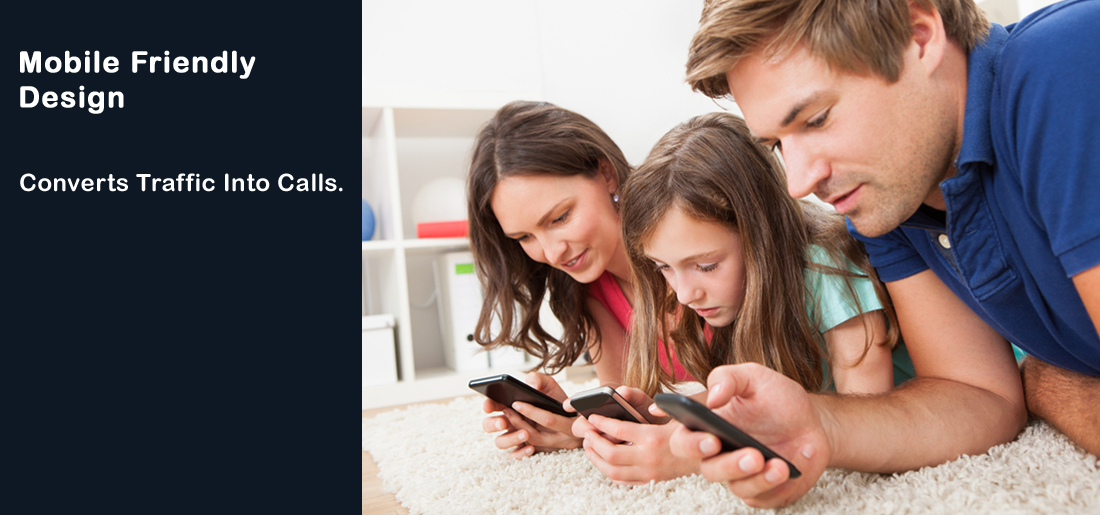
Most visitors will be viewing your website on a mobile phone. Our #1 priority is converting that traffic into calls and new customers. If your visitors do not like what they see, or can't find what they are looking for - quickly and easily - you lose that sale. About 50% of mobile visitors view websites in upright view, about 50% use landscape. We wanted 100% of visitors to be able to view "all" your content and offerings. We also wanted to make sure your website still looks great on desktop.
Most designers use WordPress to create a responsive web design on desktop and mobile. However, WordPress automatically eliminates key elements of your website when viewed on mobile. So, you have a full menu on desktop view, but not on your phone - just a 3 line menu bar. WordPress updates can break your site and it is not good for optimization. We wanted more for you.
We experimented with lots of responsive design programs, they all failed to give us what our clients need. We decided to continue designing custom sites in HTML and spent months developing codes that create true responsive designs that give you full control of how your website looks on any device.
For clients that need a lot of smaller text on a web page – we invented Mobile Zoom. The font is smaller on desktop and mobile. Then with one click on the magnifying Icon – the text on the whole page enlarges. Click the icon below to view this page in Mobile Zoom.
|